All work

Independent Concept

Kabab King

Kabab King is an independent website redesign concept created by Eass Aslam as a portfolio exploration. It combines a storefront-led visual system, responsive restaurant content, and an interactive sample menu in a statically exported Next.js experience.

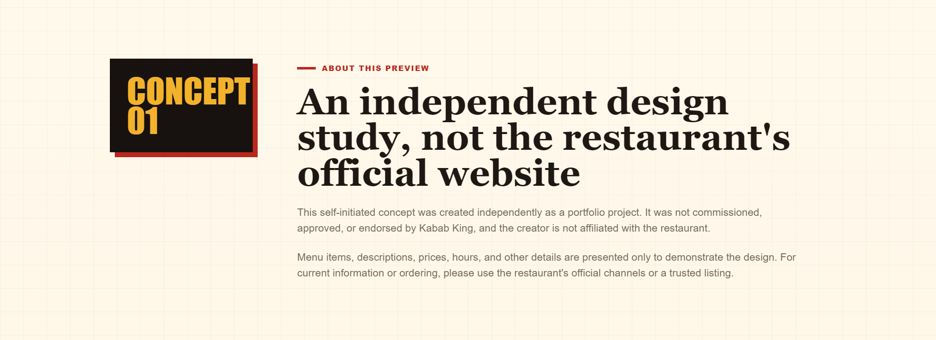
Independent concept. Created as a portfolio exploration, this work was not commissioned, approved, or endorsed by Kabab King, and it is not the restaurant’s official website.

Project
Responsive restaurant website concept
Role
Independent designer and frontend developer
Year
2026
Services
Independent website concept design, Responsive UI design, Frontend development, React and Next.js migration
Technology
Next.js 16, React 19, JavaScript, CSS, App Router, Next Image
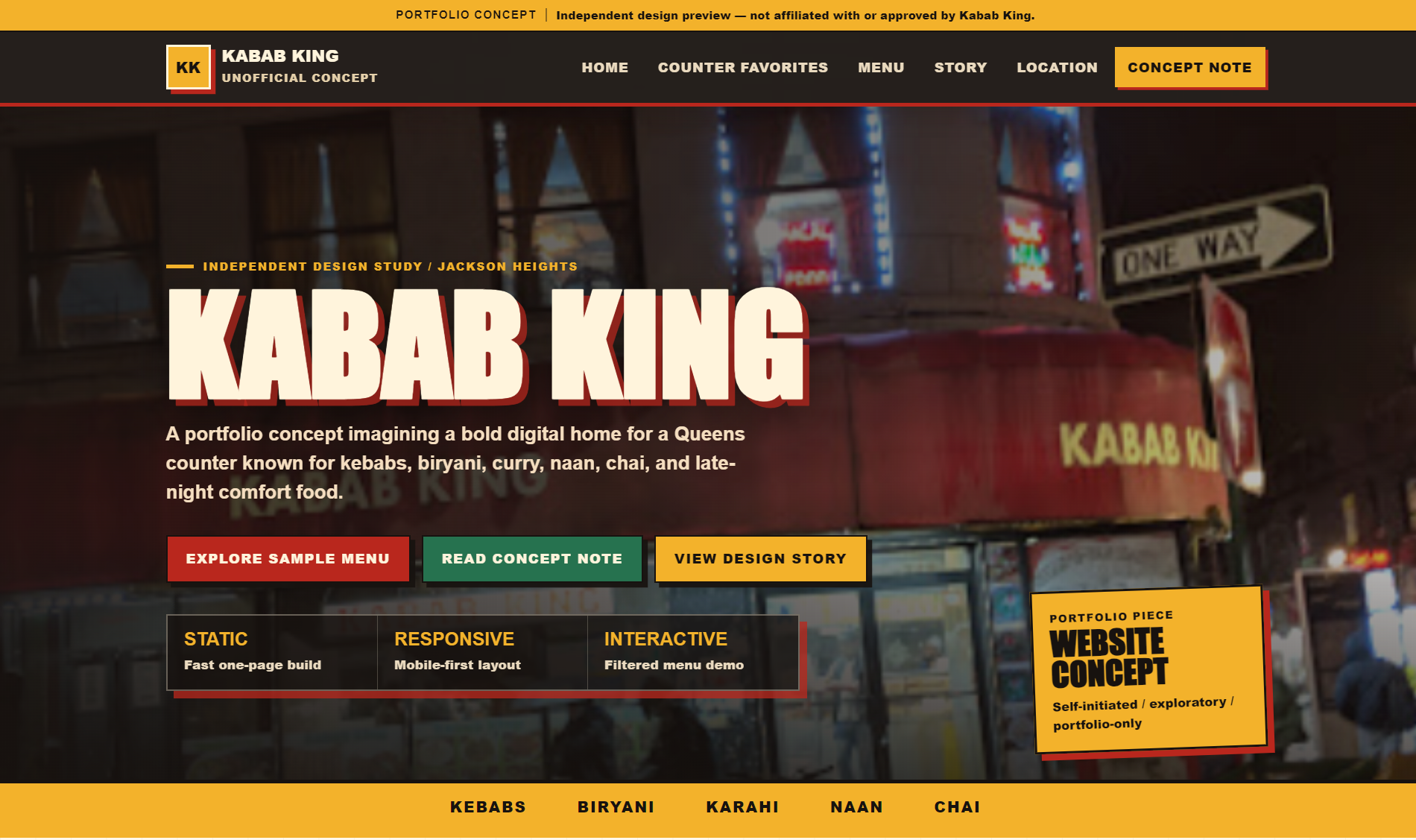
Desktop Kabab King concept hero showing the portfolio disclosure, storefront-led composition, oversized title, concept actions, and menu marquee
Desktop concept hero with the independent-project disclosure visible above the navigation.

01 / Project context

An identity opportunity, not a measured business problem.

Eass explored the redesign after observing that the restaurant’s existing online presence was a basic HTML page relying largely on menu images. The opportunity was not a measured traffic or conversion problem; it was a chance to imagine a more expressive, structured identity for the restaurant online. The preview was designed independently before any contact with the business and later reframed as portfolio-only work.

02 / Observed opportunity

Moving beyond a page built mainly around menu images.

The existing page communicated basic menu information but did little to express the personality Eass associated with the physical storefront and late-night counter experience. The concept therefore focused on identity and information hierarchy without claiming that the restaurant had requested a redesign or that any business outcome had been measured.

03 / Design objective

A direct, memorable one-page restaurant concept.

The design objective was a distinctive, responsive one-page experience that felt quick, direct, memorable, and rooted in the storefront. Research covered the restaurant’s existing online presence and competitor websites, while restaurant-specific details remained illustrative until they could be verified.

The page was organized around transparent concept disclosure, a storefront-led hero, counter favorites, an interactive sample menu, a design story, and reference-only location actions. The menu and calls to action demonstrate the intended journey without pretending to provide live ordering or verified business information.

The original static HTML, CSS, and JavaScript concept was later converted to React and the Next.js App Router while preserving the established visual design and interaction model.

04 / Visual direction

Storefront energy shaped into a responsive editorial system.

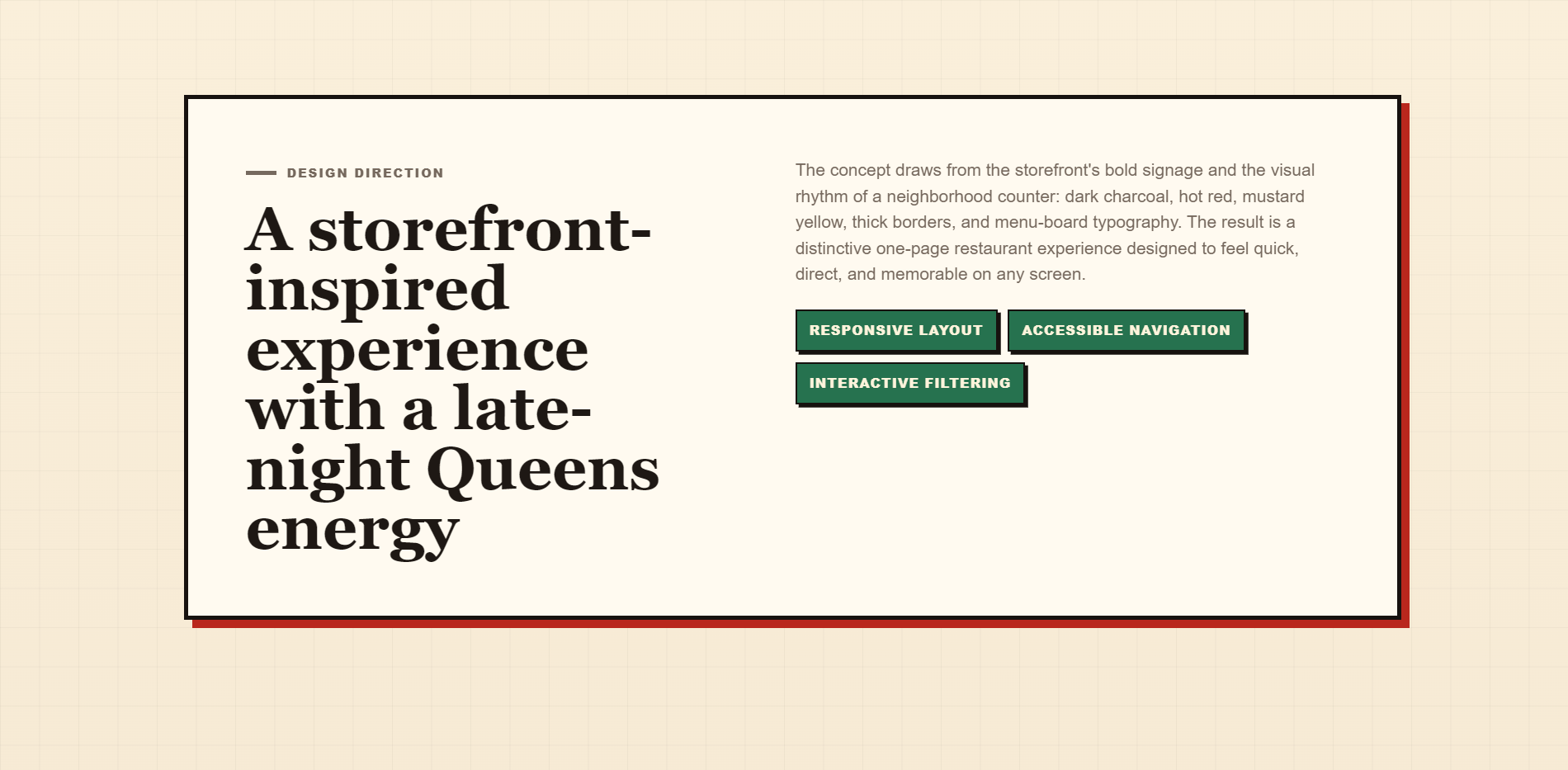
The implemented direction borrows the force of storefront signage and menu boards: coal surfaces, warm cream, hot red, mustard, green, heavy rectangular borders, hard offset shadows, and oversized editorial type. Impact creates the sign-like display voice, Georgia brings contrast to story and menu headings, and Arial keeps navigation and interface copy direct. The intended mood is a late-night, old-school diner with bold type and warm color, expressed without claiming an official Kabab King brand system or undocumented cultural-art influence.

05 / Color palette

Warm storefront color against late-night contrast.

These are implemented concept colors, not an official Kabab King brand system. Their documented function is to create warmth, nighttime contrast, and storefront energy.

Coal

#17120F

Forms the hero, header, menu board, and strongest nighttime surfaces.

Ink

#1E1814

Carries primary text, heavy outlines, grid lines, and hard shadows.

Paper

#FFFAF0

Provides the main warm card and editorial-panel surface.

Chalk

#FFF4DC

Keeps text and borders warm and legible against dark sections.

Hot red

#B9271D

Marks primary actions, rules, emphasis, and offset shadows.

Mustard

#F3B22B

Highlights the disclosure banner, active filters, labels, and marquee.

Green

#26724F

Supports secondary actions, feature tags, and location graphics.

Blue

#1E5C72

Adds a cool secondary tone to the stylized location treatment.

06 / Typography

Three system-font voices for signs, stories, and interface copy.

Impact, Georgia, and Arial are system fonts used for distinct functional roles; the concept does not introduce a custom typeface narrative.

Display / storefront

Impact, Haettenschweiler, 'Arial Narrow Bold', sans-serif

Kabab King

Impact supplies the condensed, forceful voice used for the hero title, sign blocks, and concept labels.

Editorial headings

Georgia, 'Times New Roman', serif

Late-night Queens energy.

Georgia creates contrast for section storytelling and menu names within the heavier sign-board system.

Body and interface

Arial, Helvetica, sans-serif

Explore the sample menu.

Arial keeps navigation, buttons, labels, descriptions, and filter controls direct and readable.

07 / UX and structure

Demonstrative interaction without pretending to be live commerce.

01

Concept-first disclosure

The unofficial classification appears before the identity and is repeated around demo content so the work cannot be mistaken for the restaurant’s official site.

02

One-page hierarchy

Fixed anchor navigation connects the hero, favorites, sample menu, story, location, and concept note without adding unnecessary route depth.

03

Category-based menu filtering

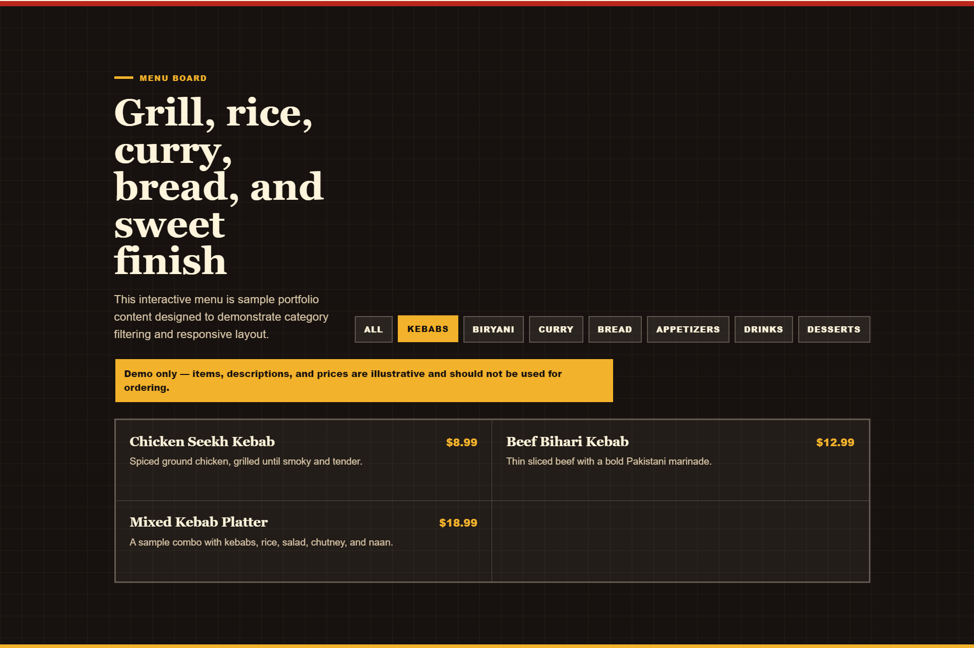
Eight category controls filter seventeen illustrative menu items through local React state, with pressed and live-region states exposed accessibly.

04

Responsive navigation

The desktop anchor navigation becomes an ARIA-connected React hamburger menu at compact widths.

05

Food and menu hierarchy

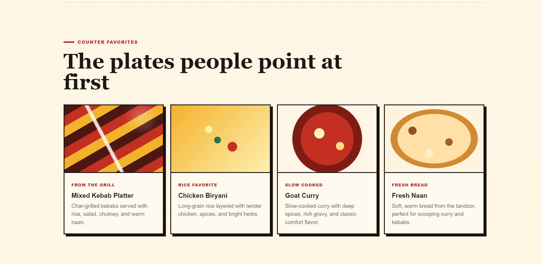
Favorites cards, prototype CSS food artwork, menu tabs, prices, and demo warnings create a scannable restaurant-content system.

06

Mobile adaptation

Component-specific breakpoints stack actions and grids, reflow tabs, resize the hero title, and preserve readable interaction targets down to the verified 390-pixel layout.

08 / Website showcase

The concept across hierarchy, content, and screen sizes.

Every capture keeps its verified intrinsic ratio. Framed desktop and device presentations provide readable section views without stretching the source files.

One identity across desktop and mobile

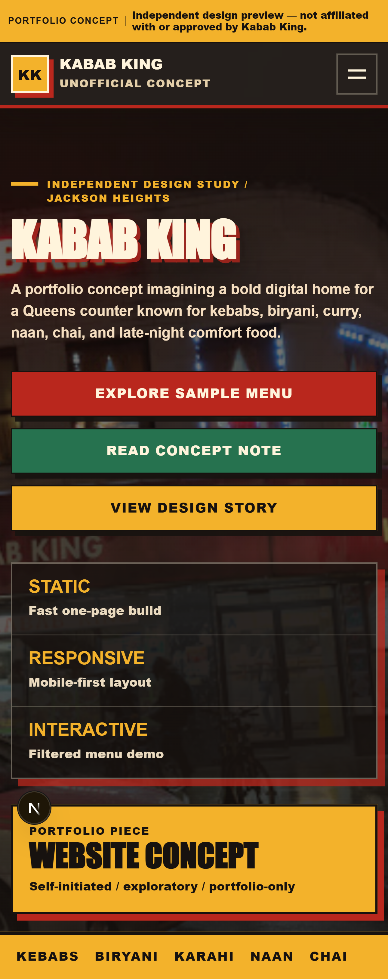
The same disclosure-first hierarchy, bold storefront title, actions, and concept ticket adapt from a wide composition to a stacked mobile experience.

Wide desktop view of the Kabab King independent concept hero and its disclosure-first navigation
Desktop hero
Tall mobile view of the Kabab King concept hero with disclosure banner, hamburger navigation, stacked actions, and project ticket
Mobile hero

Transparent framing and design intent

The concept note states the non-affiliation plainly, while the design-story panel documents the actual storefront-inspired visual language.

Kabab King concept note stating that the project is independent and not the restaurant’s official website
Independent-concept disclosure
Kabab King design-direction section describing the storefront-inspired late-night Queens visual system
Implemented design direction

Food hierarchy and menu interaction

Prototype food artwork establishes a visual rhythm before the interactive sample menu introduces filters, clear demo warnings, and a two-column desktop list.

Counter Favorites section with four bordered food cards and CSS-generated prototype food artwork
Counter Favorites
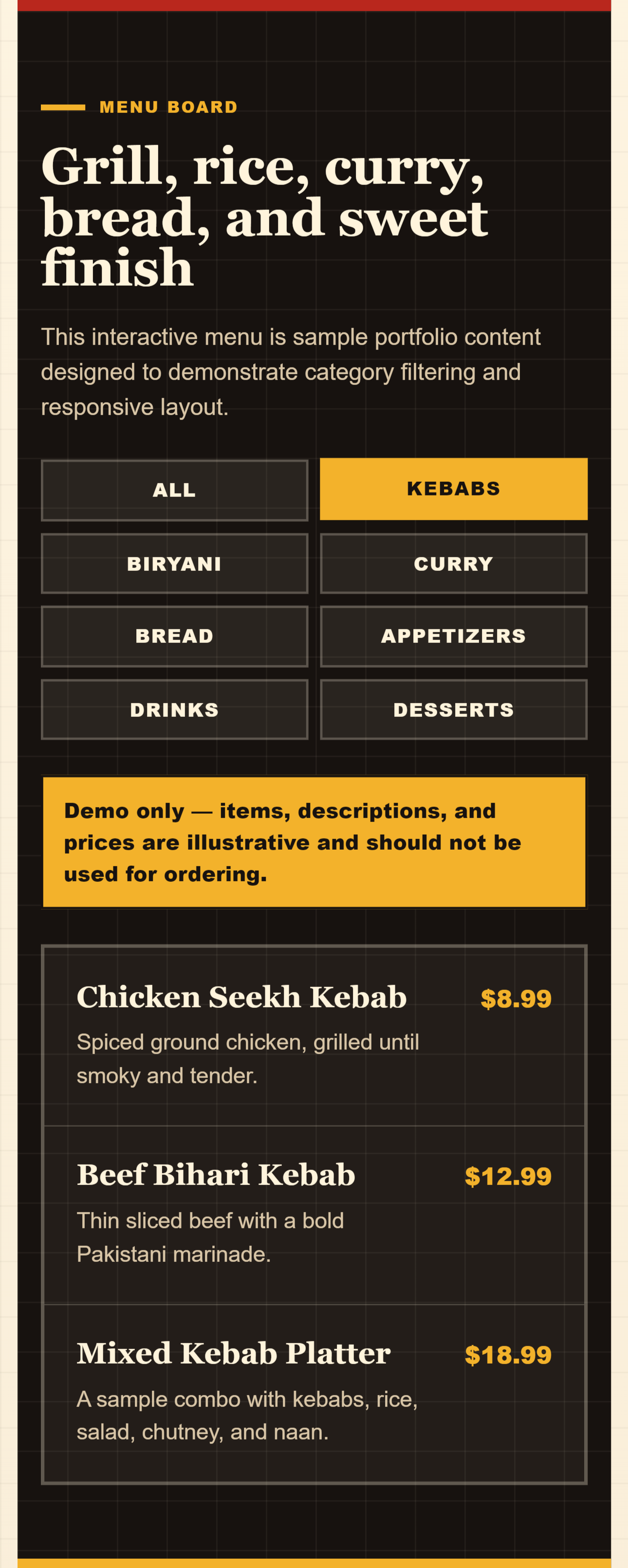
Desktop sample menu board with category filters, illustrative-content warning, and filtered kebab items
Desktop sample-menu filter

The menu board on a compact screen

On mobile, category controls reflow to two columns and menu items stack into a single readable list without changing the illustrative-content warning.

Tall mobile sample menu with two-column category controls, demo-content warning, and stacked kebab items
Mobile sample-menu adaptation

09 / React and Next.js implementation

A visually faithful conversion with a focused client boundary.

The concept began as a static HTML, CSS, and JavaScript page. It was later converted to Next.js App Router and React, moving the document shell and metadata into the app directory and separating the hero, responsive header, and menu preview into focused components.

Most content remains server rendered. Client-side React is limited to the mobile navigation and menu filter, where local state drives open, active, pressed, and filtered states. Favorites and menu items are rendered from data arrays rather than repeated markup.

The interface uses one global CSS file with custom properties, Grid, Flexbox, gradients, and breakpoints at 1040, 920, 820, and 460 pixels. The hero uses Next Image with a static import in the concept project, while this portfolio uses verified intrinsic dimensions for every local screenshot to prevent layout shift.

The concept is configured as a static export and includes metadata, semantic landmarks, visible focus treatments, ARIA state for interactive controls, and safe external-map behavior. It has no ordering, payments, reservations, backend, CMS, analytics, or live menu management.
10 / What I learned

The complete page should feel like the place it represents.

The central learning was that a website’s visual design and complete layout should reflect what the business feels like in real life. The project also clarified that producing a strong concept and earning adoption are different parts of design practice, and that speculative work should remain visibly separate from official client work.

11 / A commissioned version

Official production work would begin with verified content and permission.

If a business commissioned a production version, the concept would need a new content and approval phase rather than treating the portfolio demo as launch-ready.

  • A verified menu, prices, hours, location details, and business-approved copy
  • Original, approved storefront and food photography with documented publication rights
  • Confirmed branding and an owner-approved restaurant story and biography
  • Real ordering, reservation, or delivery integrations only if the business selected and supported them
  • A final accessibility, mobile, metadata, and content review against production material

Independent concept

Explore more work or start a useful project.